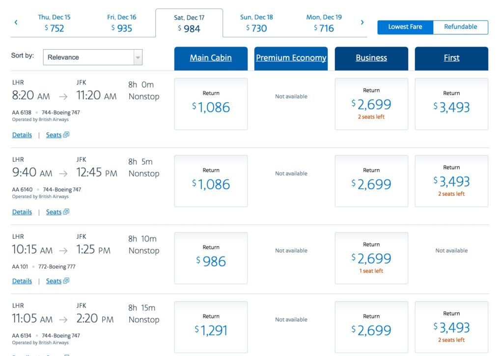
Today it appears that AA has revamped its booking interface over the weekend and it’s a lot harder to use.
Granted it may looks smarter, but it seems to have a lot of flaws:
- The cheapest price is not always immediately visible – see above – the $984 fare is not shown on the first few lines
- All the fares are in US$ although this is the americanairlines.co.uk web site which used to quote in British Pounds
- You can no longer sort fares by licking at the top of a column, meaning that you might have to hunt through lines and lines before finding the cheapest fare
- You have to switch the display by choosing a new drop down in ‘Sort by:’ if you want to look for fares by
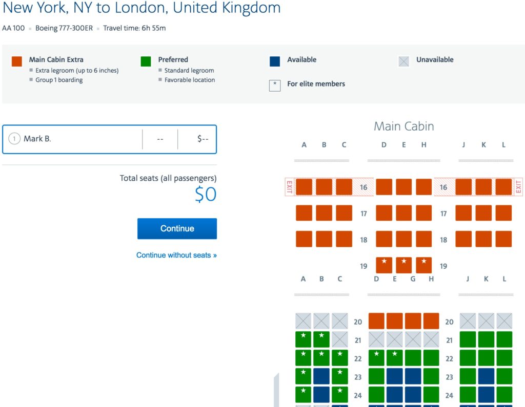
- The seat charts can only be seen towards the end of the booking process but there are new images for the seat charts too:

- It does show how many status miles you will earn for the trip:

However, it doesn’t make it easy to generate complex trips where you wish to force connections or check routings.
The booking engine for award tickets appears unchanged and quotes taxes correctly in pounds sterling from the UK web site.


I totally and completely agree with you! I really wish that AA would bring back the previous reservation system.