The Hyatt web site appears a major redesign overnight. Whilst the landing page is pretty much the same, once you go to make a reservation, the pages are fresher and bolder than the old site.
Not too much change on the new home page – although it is a lot less fussy than before:
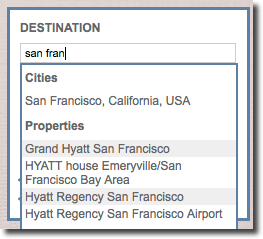
Searching for a city now lists the properties that Hyatt operate in the city:
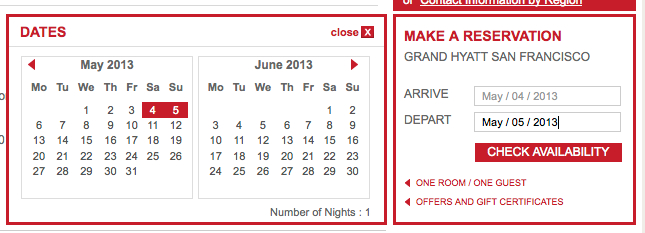
Clicking on the Check-In/Check-Out box opens a calendar which can be clicked:
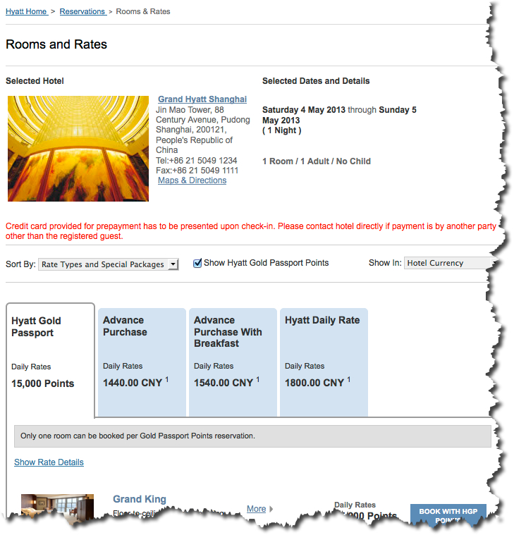
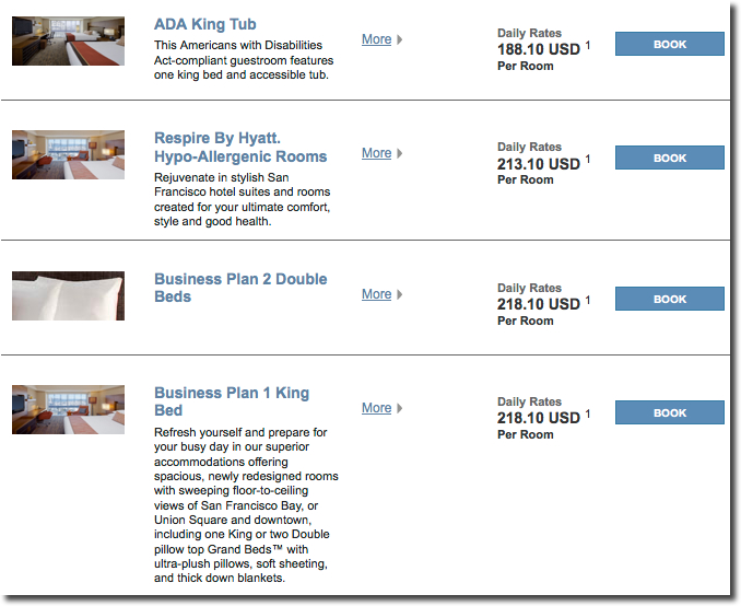
Once you select a property, the rates available are presented in a vertical list by room type, with different rates offered on tabs across the top. Ticking a box displays Gold Passport point rates for each room type:
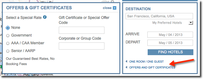
 Clicking on the Offers and Certificates link, pops open the familiar box where you can request special rates:
Once you select a special rate these are listed in the property display, and against each room type:
 As you switch between properties the site remembers the special rates you selected. This is a big enhancement. In many cases rooms now come with short descriptions against each tab, helping us decide whether the room is appropriate for our needs, or comes with extra services:
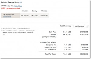
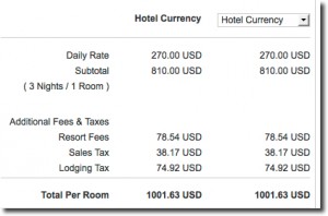
The reservation page clearly shows the whole range of taxes and charges levied:
The confirmation page at a resort clearly lists the resort fees applicable:
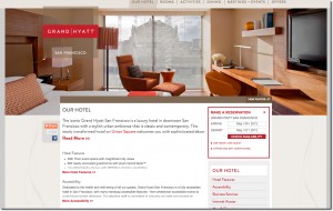
The property information pages are refreshed although I did think most of the content the same as before:
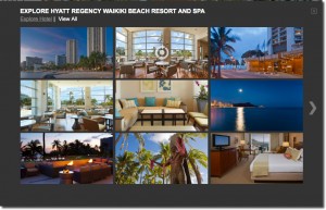
 Against each property, you can now pull up all the photos used on their web site, giving a good idea of what the property or rooms might look like before you visit:
 I did have some problems booking, although whether this related to the new site, I do not know.
Overall
A better, more modern look which matches with the make-overs being done to the properties.


Unfortunately it still will not show reward availability if you do not have enough points in your account. This is a feature Hyatt should consider adding since many people have Ultimate Rewards points now.